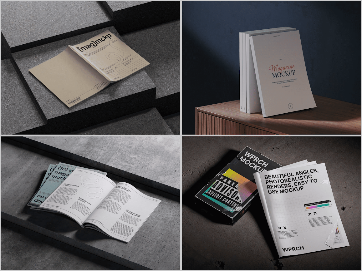
Editorial design has always been a mirror of culture, and in 2026 that mirror is cracking into something more textured, tactile, and personal. Designers presenting layouts to clients no longer rely on flat screenshots — they need presentations that feel like real print in real hands. That shift has pushed mockup design into fascinating new territory.
Table of Contents
Texture Over Perfection
The biggest shift this year is away from glossy, studio-perfect renders toward surfaces with history. Slight paper grain, soft creases, subtle light falloff — these details make a spread feel like something a reader actually picked up off a coffee table, not a sterile 3D render.
- Uncoated matte paper simulations are replacing glossy stock as the default
- Visible spine wear and page curl are now considered features, not flaws
- Ambient shadows are softer and less symmetrical, mimicking window light
A senior brand designer at Fieldnote Creative, a studio based in Portland, used a Magazine mockup to pitch a lifestyle brand’s rebrand, choosing a version with natural paper texture specifically because the client’s audience skews toward independent, artisanal publications. The tactile realism reportedly closed the pitch faster than her previous flat PDF presentation.
Motion and Interactive Previews
Static renders are no longer enough for agencies pitching multi-page editorial concepts. Clients increasingly expect a page-turn animation or a short scroll-through video before they’ll sign off on a full print run. This has pushed mockup creators to build sequences rather than single frames — a cover, a spread, a folded insert, all shown in continuity so the reader’s eye follows a believable journey through the object.
Small studios producing niche zines and indie culture magazines have adopted this heavily, since a short looping animation posted to Instagram or a portfolio site does more to sell subscriptions than a single hero image ever could.
Sustainable and Recycled Material Aesthetics
As publishers face real pressure to justify print in a digital-first world, mockups are increasingly designed to visually communicate sustainability. Kraft paper backgrounds, visible recycled fiber flecks, and muted soy-ink color palettes are showing up constantly in presentation decks for eco-conscious brands.
This isn’t just aesthetic dressing — it’s functional. A publisher pitching investors or advertisers on a relaunch wants the visual language of the mockup to match the sustainability story in the pitch deck.
Verde & Co., a design agency in Denver working with an outdoor lifestyle client, chose a recycled-stock-style presentation specifically because the brand’s entire marketing narrative centered on low-impact production, and the team wanted the pitch deck itself to visually back up that claim before the client ever saw a printed proof.
Modular, Brand-Agnostic Templates
2026 has seen a rise in modular mockup systems built for speed. Rather than one fixed magazine shape, designers want layered files where cover art, spine width, page count, and even lighting angle can be swapped without rebuilding the whole scene. Agencies juggling multiple client pitches in a single week simply don’t have time to start from scratch each time.
This modularity has become a genuine differentiator among mockup libraries. Resources like ls.graphics have leaned into this by offering layered, smart-object-based files that let designers drop in artwork and adjust presentation angles without touching lighting or shadow work — a workflow that has become close to an industry expectation rather than a bonus feature.
A production coordinator at a publishing house in Austin described relying on exactly this kind of modular file when her team pitched three competing cover concepts to an editorial board in a single afternoon, swapping artwork into one master template instead of rebuilding scenes from scratch for each option.
Hyper-Specific Niche Presentation Contexts
Generic “magazine on a table” scenes are giving way to highly specific staging: a copy tucked into a tote bag on a subway seat, a spread photographed under a barista’s counter light, a stack beside a record player. Context sells relevance. A music culture publication wants its mockup shot to look like it belongs in a vinyl shop, not a generic studio.
Independent publishers launching Kickstarter campaigns have leaned into this trend particularly hard, since backers respond better to lifestyle-contextual imagery than isolated product shots. One small print-only quarterly reported noticeably higher pledge conversion after switching their campaign hero image from a plain white-background mockup to one styled inside a lived-in reading nook.
Bold Typography Meeting Physical Constraints
Cover typography trends for 2026 are pushing oversized, saturated type — but designers now test these choices directly on textured mockups early in the process, rather than waiting for print proofs. Seeing how a heavy sans-serif interacts with matte paper grain, or how metallic foil type reflects under angled light, has become part of the standard design review rather than an afterthought.
- Oversized single-word cover mastheads paired with minimalist imagery
- Foil and spot-gloss simulation used to preview premium finishes before print
- High-contrast color blocking tested against realistic ambient lighting
In short, typography decisions that once waited for a print proof are now settled on-screen, days or weeks earlier — saving both budget and last-minute surprises when the ink finally hits paper.
The Bigger Picture
What ties all ten of these shifts together is a simple truth: presentation has become part of the product itself. A mockup isn’t just a stand-in for the printed page anymore — it’s often the first (and sometimes only) impression a client, backer, or reader gets before committing. The teams pulling ahead in 2026 aren’t necessarily the ones with the biggest budgets, but the ones treating that first impression with the same craft, honesty, and attention they’d give the actual print run.
Number